The Starbucks logo is one of the most recognized brand marks in the world. As iconic as the coffee itself, the green siren has become a global symbol of quality, consistency, and lifestyle. From its origins in Seattle to its modern minimalist design, the logo has evolved alongside the company’s growth. In this article, we explore the history, redesigns, and symbolism behind the Starbucks logo — and why it remains relevant in 2025.
Founded in 1971 in Seattle, Washington, by Jerry Baldwin, Zev Siegl, and Gordon Bowker, Starbucks drew inspiration from maritime tradition. The first logo featured a detailed twin-tailed siren — a mythical sea creature known to lure sailors — surrounded by the words “Starbucks Coffee, Tea, and Spices.”
This siren symbolized the exotic, irresistible nature of high-quality coffee. The vintage design fit the brand’s humble beginnings, but as Starbucks evolved, so did its visual identity.
1971–1987: The Original Brown Logo
A brown circular logo showcased a woodcut-style siren, representing the brand’s artisanal coffee roots.
1987–1992: Enter the Green Siren
With Howard Schultz leading Starbucks into the coffeehouse business, the logo was updated. Green replaced brown, symbolizing freshness, growth, and prosperity. The siren became more refined, and the brand name was simplified.
1992–2011: A Global Shift
The siren’s face and tail took center stage as the design zoomed in. The green circle brightened, and typography was modernized, making the logo more adaptable to global branding needs.
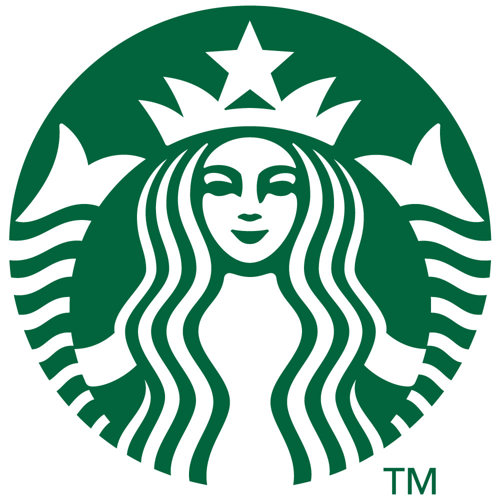
2011–Present: Wordless Confidence
For its 40th anniversary, Starbucks dropped all text from the logo. The siren now stands alone — an iconic symbol that transcends language, appearing on stores, cups, and apps worldwide.
Each element of the logo reflects deep brand values:
Siren: Inspired by a 16th-century Norse woodcut, she represents allure, tradition, and the ritual of enjoying coffee.
Green Color: Conveys sustainability, freshness, and calm values that Starbucks champions.
Circle Shape: Symbolizes unity and global connection.
Minimalism: The logo's latest version speaks for itself — no name needed.
Even in 2025, the Starbucks logo remains a powerful brand tool. It’s flexible, clean, and memorable — ideal for everything from storefronts to smartphone screens. Whether printed on merchandise or glowing on a digital app, the siren holds meaning for millions.
The logo also plays a role in promoting Starbucks’ core values — sustainability, diversity, and innovation. Each redesign has reflected a shift in brand vision while maintaining its emotional appeal.
What can marketers and designers learn from this evolution?
Keep it simple: Recognition comes from clarity, not complexity.
Evolve with intention: Every redesign served a strategic purpose.
Symbols matter: A logo can become language-independent if it's emotionally resonant.
Build connection: The Starbucks siren isn’t just a logo — it’s a feeling.
The Starbucks logo is more than just a graphic — it’s a global identity. Its evolution tells a story not just of a brand, but of modern branding itself. In a crowded world of visuals and logos, Starbucks proves that with the right design, your brand can transcend borders, languages, and trends.